


Key takeaways
Allbirds, a sustainability-driven footwear and apparel brand, has garnered considerable attention for its minimalist yet compelling approach to e-commerce. This report examines the key elements of Allbirds’ Product Detail Page (PDP) design—analyzing how it balances clarity, user experience, and conversion outcomes. While the brand’s broader reputation rests on simplicity, comfort, and sustainability, the PDP is where these values must translate into an effective and persuasive online shopping experience.
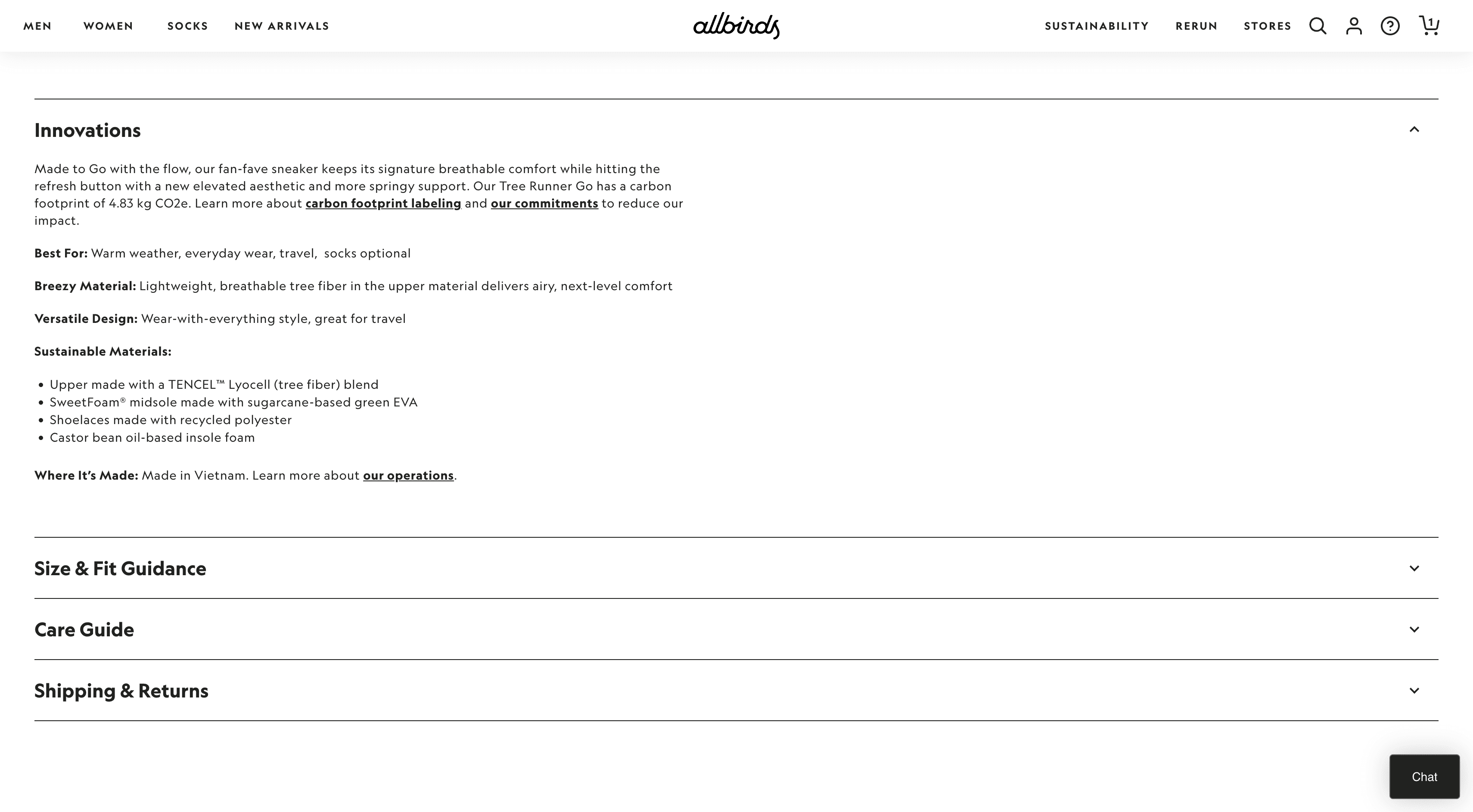
Layout & Page Structure: Allbirds’ PDP design centers product imagery, essential product details (name, price, rating), and a clear “Add to Cart” call-to-action above the fold. Additional information—such as materials, carbon footprint, sizing guides, and policy details—unfolds through collapsible sections, preserving a clean interface while satisfying users who seek deeper details [1][2].
Product Imagery & Media: Large, zoomable images from multiple angles provide a thorough view of each item, supplemented by lifestyle photos that showcase real-world use. Some pages include video clips demonstrating how shoes move and fit, appealing to users seeking a dynamic preview [3][4].
Product Descriptions & Information Hierarchy: Allbirds presents core benefits (comfort, breathability, sustainability) at a glance while tucking away technical specifics (e.g., shoe composition, carbon footprint data) under expandable sections [2][3]. This arrangement caters to both scanning and research-oriented shoppers.
Trust Signals & Social Proof: Prominent star ratings, aggregated fit data, and generous return policies build trust, while explicit references to Allbirds’ B Corp certification and carbon labeling reinforce the brand’s eco-friendly ethos [5][6].
Calls to Action & Conversion Triggers: The “Add to Cart” button appears prominently once a size is chosen, accompanied by short reminders of free shipping or a risk-free trial. Subtle scarcity cues—like “Limited Edition” colorways—provide mild urgency, while installment payment options (e.g., Afterpay) address cost-based concerns [7].
Mobile Optimization & Performance: The PDP is fully responsive, with images presented in swipeable carousels on smaller screens. To optimize loading speed, heavier media is placed lower on the page, and interactive elements (like hover-to-zoom) adapt to touch-friendly designs [8].
Psychological Persuasion Techniques: Allbirds employs social proof, risk removal, subtle scarcity, and an overarching sense of community (“Join the flock”) to encourage purchases without seeming pushy [2][7][9].
Competitor Comparisons & Recommendations: Compared with major footwear brands, Allbirds stands out for simplicity, sustainability focus, and transparency on the PDP. Potential improvements include incorporating user-generated content, refining product recommendations, and exploring optional 3D or AR features [10][11].
Throughout this PDP, Allbirds demonstrates that an online product page can support a brand’s mission—merging sustainability narratives with a frictionless path to purchase. The experience blends brand storytelling, user-centric design, and conversion principles into a cohesive whole.
Introduction
In e-commerce, the Product Detail Page (PDP) acts as the final (and arguably most critical) point of persuasion before checkout. Visitors often arrive with interest piqued by marketing or brand awareness, but they still require confirmation that the product meets their needs and values. The PDP must thus serve multiple roles simultaneously: inform, reassure, and inspire action. For a brand like Allbirds—esteemed for its eco-friendly materials and promise of supreme comfort—the PDP must translate abstract brand values (sustainability, comfort, simplicity) into convincing, tangible details that compel a user to click “Add to Cart.”
Allbirds’ approach to PDP design aligns with its direct-to-consumer ethos [1][2]. It avoids clutter and aggressively upselling tactics, instead focusing on user-friendly navigation, clear product showcases, and subtle but effective psychological triggers. By anchoring each page in genuine product benefits—such as breathability, low carbon footprint, or a risk-free trial—Allbirds creates an environment where shoppers feel both informed and at ease. This approach is in line with modern DTC best practices, which emphasize forging an authentic connection over a hard sell.
The analysis that follows explores each crucial aspect of Allbirds’ PDP, examining how layout, product imagery, descriptions, trust elements, mobile optimization, and competitor comparisons all factor into the brand’s strategy. We also highlight potential improvements, such as expanding user-generated content or adding interactive features for deeper engagement. By examining these elements in-depth, we aim to illustrate how Allbirds has shaped a PDP that resonates with contemporary shoppers seeking sustainable, high-quality products without sacrificing convenience or style [5][6]. Whether other e-commerce brands replicate or adapt this approach, Allbirds offers a valuable blueprint for melding brand storytelling with user-centric functionality.
Layout and Page Structure
Above-the-Fold Essentials
Allbirds’ PDP is designed to front-load critical information. At the very top (often called “above the fold” in web design), a user typically sees:
Product Title and Star Rating: The name of the shoe or apparel piece is accompanied by an average star rating—e.g., 4.7 out of 5—plus a review count [1][9]. This immediate social proof sets a positive tone.
Price and Payment Options: The standard product price is visible, and where applicable, an installment payment option (like “Pay in 4 interest-free installments with Afterpay”) might be mentioned just beneath [1][7]. This addresses cost objections upfront.
Size and Color Choices: Users can quickly see color swatches (including “Limited Edition” disclaimers) and a grid or drop-down for sizing. Selecting a size is mandatory before adding to cart, preventing checkout errors.
Prominent CTA: A bold “Add to Cart” button, often in a contrasting color, sits near the sizing interface [1]. Surrounding text may note free shipping or returns, easing hesitations about extra fees.
Positioning these elements front and center reflects a “don’t make me think” principle—newcomers can easily locate essential purchase info without hunting [2]. By omitting extraneous content from this zone (e.g., no verbose paragraphs or unrelated links), Allbirds ensures each item’s PDP immediately orients users around the key aspects: product rating, price, style, and size availability. This approach caters well to impulse or decisive buyers who want to quickly evaluate essential details [3].
Information in Layers
Below these core details, Allbirds employs collapsible sections to accommodate shoppers who want more specifics [2]. For instance, a panel titled “Description” might expand to reveal a narrative about the shoe’s design philosophy, comfort features (like eucalyptus tree fiber for breathability), or target uses (light running, casual everyday wear). Another accordion, “Materials,” might enumerate each component—merino wool uppers, sugarcane-based foam midsoles, recycled laces—along with an estimated carbon footprint in kilograms of CO₂e [5][6]. A “Care Instructions” toggle can outline washing or spot-clean tips, beneficial for users who worry about upkeep.
This accordion system keeps the PDP streamlined: casual shoppers see only highlights unless they choose to dig deeper, while detail-oriented visitors can explore the finer points [3]. It’s a pragmatic solution to e-commerce’s “information overload” dilemma. Instead of overwhelming the user with a single, giant text block, Allbirds organizes content by category, letting the user pull what they need. This layering technique resonates with modern usability guidelines, which stress that content should be easily scannable yet comprehensive for those who desire it.
Structured Consistency
Consistency across product pages is another pillar of Allbirds’ layout strategy [1]. Whether a user is viewing Tree Runners, Wool Loungers, or apparel items, the same basic PDP framework applies: large images on the left, product name and star rating top-right, CTA under size selectors, and collapsible info further down. This uniformity speeds up user comprehension (returning visitors know exactly where to look) and reinforces brand identity. Allbirds further unifies the pages with consistent color palettes—simple backgrounds, minimal text styling, and frequent white space evoke a calm, friendly atmosphere.
A subtle example of structured consistency is how Allbirds handles navigational elements. Typically, the top site menu remains visible (or becomes a hamburger icon on mobile), so users can hop to other categories or check their cart without scrolling back to the top. The PDP also contains a breadcrumb trail (e.g., “Home > Men’s > Men’s Tree Runners > Product Name”) so visitors can retrace steps if they prefer to browse a broader category [1]. These navigational anchors ensure that even mid-funnel shoppers can pivot gracefully, a practice that fosters a sense of control and helps reduce site abandonment rates.
Expanded Detail and Comparison
In some competitor sites, the PDP might feature side-by-side comparisons or additional subcategories (e.g., “Other styles in the same material” or “Compare with our running line”). Allbirds tends to avoid clutter but does occasionally showcase “You May Also Like” or “Recently Viewed Items” near the bottom. This approach is minimal relative to a typical department store e-commerce page (like a Zappos listing, which might have extensive cross-selling). Allbirds uses these recommendation blocks sparingly, typically focusing on complementary items like socks or a different color in the same shoe line [2].
By keeping the main column devoted to the product itself, Allbirds underscores each item’s uniqueness. This is especially important when marketing distinctive materials (such as tree fiber or wool). Overly broad comparisons might dilute that focus. However, from a user experience standpoint, it might be beneficial to have a small “Compare Our Styles” section, where a user unsure between a Tree Runner and a Wool Runner could see differences spelled out. Currently, Allbirds mostly relies on separate product pages and minimal linking. An expansion or A/B test could determine whether providing a “Compare” link fosters quicker, more confident purchases, especially for new customers uncertain about which shoe best fits their climate or use-case.

Product Imagery and Media
Multiple Angles and Zoom
In footwear e-commerce, high-quality images can make or break conversions, as shoppers cannot physically handle the product [3]. Allbirds excels here, typically offering 6–8 photos per item covering front, side, back, top-down, and angled views. The brand also includes close-ups revealing fabric texture (like the knit pattern of Tree Runners or the fuzzy interior of Wool Loungers). Zoom functionality (hover on desktop, pinch or tap on mobile) allows prospective buyers to examine details such as stitching or midsole thickness.
This multi-angle approach builds confidence in the product’s authenticity and quality. Users can virtually “inspect” the shoe. It also reduces the likelihood of surprises post-purchase, which in turn lowers return rates and fosters trust. Some e-commerce experts recommend a 360° spin or 3D model for shoes, which would let buyers rotate and tilt the product in real time. Allbirds has not fully adopted 3D spins—likely to maintain faster load times and simpler visuals—though exploring this option could enhance engagement for certain lines [10]. For now, the brand relies on multiple static images to approximate a full view.
Lifestyle Context
A hallmark of Allbirds’ PDPs is the integration of lifestyle photography, showing people wearing the shoes in realistic settings, such as walking in a park or relaxing in a cozy interior [4]. This approach addresses the emotional side of shopping: buyers want to see themselves in the brand’s world. By presenting an everyday scenario, Allbirds signals that these shoes seamlessly fit casual routines. This is a departure from sports-oriented brands (like Nike or Adidas) that rely heavily on action shots or athlete endorsements. Allbirds’ tone is more laid-back, underscoring comfort and simplicity.
Lifestyle imagery also showcases how various outfits might pair with the shoe. A key user question—“Will these match my wardrobe or daily style?”—is partially answered visually. The photos highlight color variants (from neutral grays to bright limited editions) in context, helping users decide which color suits them. While major footwear competitors may offer a broader range of styling images, Allbirds typically keeps these lifestyle shots minimal and aligned with its low-key vibe. This restraint ensures the product remains the primary focus, but a few more images or videos featuring movement might further enhance the aspirational quality of the brand.
Short-Form Video
For certain products, Allbirds embeds short videos that show the shoe in motion—perhaps a runner’s feet on a sidewalk, or a 360° swirl shot [8]. These videos can be crucial for prospective buyers seeking a dynamic sense of flexibility, cushion, or style in use. A short loop with no sound keeps the page from feeling intrusive or slowing performance. Visitors who prefer a quick snapshot can ignore the video, while those wanting more immersion can watch it. This form of “micro-video” is increasingly popular in e-commerce, as it satisfies curiosity without requiring a multi-minute marketing reel.
Allbirds is mindful about placing these videos further down the PDP, ensuring they don’t impede the initial load above the fold. This technique, known as “lazy loading,” helps preserve fast performance—an essential factor, given that users abandon slow pages at high rates [8]. For heavier or more advanced features, the brand might rely on off-page solutions, like a dedicated “technology” or “how we make them” page. But keeping a short teaser on the PDP is usually enough to give users an engaging taste of the product in motion.
Potential Expansion: AR Previews
While Allbirds hasn’t publicly embraced augmented reality (AR) try-ons at scale, some footwear brands now offer AR overlays that let shoppers see how a shoe appears on their own feet via a smartphone camera [10]. This can be especially helpful for those worried about style or fit. Implementing AR would be a notable step toward bridging the online-offline divide, but it carries costs and potential site speed implications. Still, as AR becomes more commonplace—and phone hardware continues to improve—Allbirds might test a lightweight version for key products, especially if it aligns with the brand’s ethos of transparency (“what you see is what you get”). This would be an intriguing evolution of the brand’s visual strategy, potentially boosting engagement among tech-savvy customers.
Product Descriptions and Information Hierarchy
Benefit-Focused Copy
Allbirds structures its PDP text to highlight the user benefits first, rather than leading with pure technical specs [2]. For instance, rather than a bullet reading “Upper made from merino wool with 21-micron fiber thickness,” the brand might say, “Soft and itch-free merino wool for unbeatable comfort.” Similarly, mentions of “sugarcane-based midsole” become “lightweight, cushioned foam that cuts carbon emissions.” By framing material facts as direct benefits (comfort, breathability, sustainability), the copy resonates more with the customer’s desires and alleviates any friction they might have about performance or environmental impact.
This tactic aligns with broader marketing psychology: intangible features (like “carbon-neutral process” or “RWS-certified wool”) gain traction when linked to shopper values (like “guilt-free shopping” or “cozy feet in any weather”). Although Allbirds seldom uses overt marketing hype, the brand cleverly interweaves core product benefits in a friendly, approachable style. This fosters a sense that Allbirds truly wants to inform, not just sell—an approach consistent with the brand’s laid-back persona [3].
Detailed Sections
Beyond the short bullet points, Allbirds arranges deeper info into collapsible sections labeled “Description,” “Materials,” and sometimes “Care Instructions” or “Sustainability” [1]. The “Description” panel typically expands into 1–2 paragraphs discussing:
Design Inspiration: e.g., “Inspired by the comfort of a wool sweater, we aimed to create the softest runner yet.”
Intended Use Case: e.g., “Great for casual walks, travel, or light exercise.”
Unique Differentiators: e.g., “Machine washable, odor-resistant, naturally moisture-wicking.”
The “Materials” section often includes bullet points detailing each layer of the shoe (upper, insole, midsole), referencing the carbon footprint for each part if relevant [5][6]. This transparency is unusual in footwear, as many brands keep material details vague. By showing they have nothing to hide, Allbirds underscores its commitment to responsible manufacturing.
Finally, “Care Instructions” or related panels can mention machine-wash guidelines: “Pop them in a gentle cycle, air dry—no bleach or excessive heat.” This is crucial for shoes like Wool Runners, as new customers may worry about shrinking or damaging them. Each instruction further reduces friction around ownership: a shopper thinks, “Oh, that’s easy enough,” thereby removing a barrier to purchase.
Sizing Guidance
An additional sub-section or callout is often dedicated to sizing tips [1]. For example, “True to size. If you’re between half sizes, we recommend going up.” Some PDPs also reference a “Find Your Fit” chart, guiding users on length in centimeters. This preempts a top reason for returns—incorrect fit—and leverages Allbirds’ 30-day wear test to alleviate lingering doubt. Notably, Allbirds uses aggregated data from returns and reviews to refine these sizing notes over time, aligning with best practices in footwear e-commerce. This ongoing iteration fosters a sense of reliability, as the brand’s advice presumably reflects thousands of user experiences.
Adding Depth for Tech-Savvy Users
Currently, the brand’s approach suits mainstream shoppers well, balancing brevity and detail. However, certain advanced customers—like serious runners or folks with foot conditions—might crave extra data (arch support specifics, heel drop measurements, sole durability metrics). Allbirds includes some of this data in performance-focused lines (like Tree Dashers), but could consider adding a specialized “Technical Specs” tab for deeper reads. This could detail stack height, midsole density, or breathability test results. While some might argue it conflicts with the brand’s minimalist style, making it collapsible ensures it doesn’t clutter the page. This approach could capture a niche but loyal segment of advanced users who appreciate in-depth data.
Trust Signals and Social Proof
Prominent Ratings and Reviews
From a user’s perspective, star ratings offer immediate validation [9]. Seeing a 4.5–5.0 average star rating (often with hundreds of reviews) signals that many customers had a positive experience, which eases doubts about quality or comfort. Allbirds typically places this rating near the product name, ensuring it’s within the user’s initial glance [1]. Clicking it may jump the page to the reviews section, which can include written comments about fit, comfort, style, and durability.
Unlike some e-commerce sites that bury reviews at the bottom or require separate tabs, Allbirds strives to keep them seamlessly integrated. By presenting an average rating upfront, plus a snippet on how the shoe runs (e.g., “86% say fits true to size”), Allbirds addresses a primary hesitation for footwear shopping: fit uncertainty. This can drastically reduce the “What if it doesn’t fit?” friction that leads to cart abandonment.
Sustainability Credentials
Another significant trust signal is Allbirds’ emphasis on sustainability. The brand isn’t content to merely mention “eco-friendly materials”; it references third-party certifications like B Corp and provides carbon footprint labels (e.g., 8.1 kg CO₂e per pair) [5][6]. This quantification sets Allbirds apart from typical “greenwashing,” where vague statements aren’t backed by numbers. Shoppers concerned with environmental impact can see exactly how their purchase measures up. Additionally, references to recycled laces or FSC-certified packaging build credibility for those who deeply value responsible sourcing.
This transparency fosters an impression that Allbirds is honest and solution-oriented, rather than marketing gimmicks. For instance, a PDP might note, “Our Tree Dasher is part of our effort to reduce carbon emissions with every product. Using eucalyptus tree fiber lowers water usage by up to 95% compared to traditional materials.” Such claims, if well-substantiated, reassure conscious consumers. Potential expansions could include direct comparisons (e.g., “Traditional running shoes average 12.5 kg CO₂e, ours is 9.0 kg CO₂e”), giving a tangible benchmark. Such direct comparisons are sometimes avoided for fear of branding friction, but they can be compelling for truly eco-focused shoppers.
Free Returns Policy
A major trust booster is Allbirds’ 30-day no-questions-asked return policy, even if worn outdoors [2][9]. Displaying the policy near the product price or CTA signals confidence in the product. It tells shoppers, “We believe you’ll love these shoes enough to keep them, but if not, we’ve got you covered.” This approach tackles one of online footwear’s biggest anxieties—being stuck with ill-fitting or uncomfortable shoes. Combined with free shipping or returns in many regions, it lowers the perceived risk of trying the brand for the first time.
Allbirds also highlights how easy this returns process is. Typically, the website points to a straightforward portal or label printing method, further reducing friction. Some competing brands might bury return info in an FAQ or disclaim that shoes can’t be worn outside. Allbirds’ stance is refreshingly open, implying a deep self-assurance in comfort and quality. Psychologically, this fosters reciprocity: users who sense brand generosity are more inclined to buy.
Potential for User-Generated Media
A powerful form of social proof is user-generated content (UGC), such as customer-submitted photos of them wearing the shoes in real life. While Allbirds leverages star ratings and text reviews, it could integrate more visual testimonials. Some leading e-commerce sites include “See it in action” galleries or Instagram feeds with user tags. Given Allbirds’ emphasis on community (“Join the flock”), embedding a curated UGC gallery could strengthen trust and spark style inspiration. It also demonstrates product authenticity across varied body types and lifestyles—a compelling factor for hesitant or new shoppers. Although the brand occasionally features user photos on social media, systematically pulling these into the PDP would further enhance credibility.
Calls to Action and Conversion Triggers
“Add to Cart” Placement
Allbirds positions the “Add to Cart” button in a high-visibility zone, typically beneath size selectors and near a brief shipping/returns note [1]. This arrangement follows classic e-commerce heuristics: once the user chooses their size, the next logical action is a bright CTA. The language “Add to Cart” is standard, though sometimes tested alternatives like “Add to Bag” or “Get Yours” might drive marginally different click rates. So far, Allbirds sticks with the conventional label, presumably finding it clear and effective enough.
When the user clicks “Add to Cart,” some versions of the site reveal a slide-out cart or confirmation. This quick feedback avoids a full page reload, letting shoppers continue browsing if desired. Subtler triggers—like including a note “You can always return for free”—help nudge the last mile of purchase anxiety. If a user attempts to add to cart without selecting size, the interface typically highlights the size field to prompt correction, preventing confusion at checkout [2].
Limited Editions
A subtle but impactful tactic is labeling certain color variants “Limited Edition” [7]. This phrase naturally piques interest—shoppers who relish exclusivity or unique colors feel urged to act before it disappears. Allbirds avoids high-pressure countdown timers, but it occasionally notifies if a specific color is likely to sell out soon. By weaving scarcity into the PDP—rather than plastering it with urgent banners—the brand aligns with its understated tone while still leveraging psychological urgency (FOMO).
In practice, limited editions often revolve around seasonal hues or collaborations (e.g., a tie-dye collection with limited production). This approach also fosters collector behavior among brand fans, as some want to snag each special release. For less brand-loyal shoppers, the “Limited Edition” tag can be a prompt to finalize a purchase now rather than wait, especially if they enjoy distinctive colorways not found in mainstream footwear lines.
Alternative Payment Options
For some consumers, price is a gating factor. Allbirds, typically priced in the $95–$160 range, addresses this via installment payment displays (like “4 interest-free payments of $30 with Afterpay”) [7]. This small line near the price can tip cost-conscious shoppers who otherwise might delay buying. Afterpay or Klarna references have become standard in many DTC shops, and Allbirds integrates them cleanly without overshadowing the main purchase button.
Such financing references often appear in subdued text—less prominent than “Add to Cart,” but clearly legible for those scanning the price. This technique recognizes that while Allbirds shoes are premium, splitting payments can reduce psychological sticker shock. It also helps Allbirds compete with other shoe brands that might run frequent sales; Allbirds rarely does discounting but can offer flexible payment, which appeals to thrifty shoppers.
Opportunity for Upselling
The PDP itself rarely bombards users with upsell prompts, focusing on the single product. However, once an item is added to cart, Allbirds sometimes offers complementary items (like socks) in a mini-cart pop-up. This keeps the PDP pure while still capturing cross-sell opportunities [2]. That said, the brand could incorporate a small “Complete the Look” or “Perfect with These Socks” widget near the bottom of the PDP for those who prefer to add multiple items in one go. The risk is clutter, so the brand’s minimal aesthetic must be balanced with potential revenue gains. Testing these placements with real user data could reveal an optimal approach.
Chatbot & Live Support
In addition to its clear layout and informative product details, Allbirds supports customers directly on the PDP through an integrated chatbot or live chat feature. Usually displayed as a small bubble in the lower-right corner of the screen, this chat interface serves as a real-time help option for visitors who have specific questions about sizing, materials, return policies, or any other concerns that arise mid-browse. Rather than leaving the PDP to search through FAQs or contact pages, users can click the chat icon to open a conversation with either a virtual assistant or a customer support representative.
This immediate access to help aligns with modern e-commerce expectations, where shoppers often need quick, personalized reassurance before finalizing a purchase. For instance, a shopper who is unsure about the difference between “Tree Runners” and “Wool Runners” might ask for clarification on warmth or breathability. The chatbot can provide a concise response or escalate to a human agent if the query is more complex. This reduces user friction and prevents visitors from abandoning their session in frustration.
Allbirds also uses a friendly, brand-consistent tone in chat interactions, echoing the relaxed language found across the PDP. Responses might include a friendly greeting such as “Hey there! Happy to help you find your perfect fit,” reinforcing the brand’s approachable voice. Additionally, the chat widget can direct users to relevant PDP sections—such as “Sustainability” or “Size Guide”—so they can find detailed information without extensive scrolling. By meeting users where they are, in the moment of decision-making, Allbirds’ chat feature exemplifies the brand’s commitment to transparency and helpfulness, potentially increasing conversion and overall customer satisfaction.

Mobile Optimization and Performance
Responsive Layout
Allbirds recognizes that a large portion of e-commerce traffic now originates from mobile devices [11]. Consequently, the PDP is fully responsive. On a phone or tablet, the left-right layout typically collapses into a vertical stack: images become swipeable carousels at the top, followed by product title, rating, size selectors, and CTA [1][8]. Collapsible sections remain collapsible (tapped to expand), preserving the same layered info hierarchy. Buttons are scaled for thumb taps, and text remains legible without pinching or zooming. This ensures the PDP retains functionality and clarity on smaller screens.
Beyond layout, Allbirds also ensures that interactive elements like color swatches or “Limited Edition” tags remain large enough for finger presses. The brand forgoes cluttered sidebars or pop-ups that might hamper the mobile experience. While some retailers might attempt to replicate every desktop feature (like advanced filters or side banners) in the mobile PDP, Allbirds streamlines it, respecting the constraints of a touchscreen environment and user expectations for quick interactions.
Media Loading and Speed
To maintain a smooth user experience, Allbirds carefully manages loading of high-res images and video, employing “lazy loading” [12]. Rather than loading every image at once (which can slow page rendering), images or videos appear as the user scrolls, improving initial load times. This approach is critical because mobile shoppers are notoriously impatient—research suggests many abandon pages that don’t load within a few seconds [8][12]. Placing resource-heavy content, such as short product videos, below the fold lets crucial product info appear immediately at the top, ensuring users can start engaging without delay.
Caching and compression also come into play. While the brand uses large, vibrant images, file formats are optimized to avoid bloated page sizes. Some e-commerce sites compress images at the expense of quality, but Allbirds finds a middle ground—sharp visuals with relatively quick loading. The result is a polished, media-rich PDP that still meets typical mobile performance benchmarks.
Touch-Friendly Interaction
On mobile, hover effects shift to tap or swipe equivalents [1]. Thumbnails that one might hover over on desktop to change the main image become small tap targets. A user can flick through pictures side-by-side, giving them a sense of the product from all angles. Size selectors, typically in a grid layout, are spaced to reduce accidental clicks. The “Add to Cart” button is placed in a prime “thumb zone” so that right-handed users can tap it with ease.
In some e-commerce designs, a “sticky” add-to-cart bar remains visible as users scroll down. Allbirds doesn’t always implement this on its PDP, but it’s a common best practice to test [2]. A subtle sticky bar might display product name, price, and an “Add” icon, saving users from scrolling back up. Potentially, it could boost conversions among mobile users who decide to purchase midway through reading the details. However, to keep the interface uncluttered, Allbirds might prefer a single CTA area near the top. A well-designed test could clarify which approach yields better results or user satisfaction.


Psychological Triggers and Persuasion Techniques
Social Proof
Allbirds capitalizes on social proof in two principal ways:
Star Ratings: Immediately beneath the product name, the brand features a 4- or 5-star average plus a review count (e.g., “(1,245 Reviews)”) [9]. This counters potential doubts like “Am I the only one who likes these shoes?”
User Reviews Section: Further down, customers can read detailed testimonials. Many mention comfort, fit, and durability, echoing key brand promises. Some highlight personal stories (“Great for my daily commute!”), fostering an emotional connection.
Since footwear is often personal and comfort is subjective, seeing numerous positive reviews can sway on-the-fence visitors. Even the occasional moderate or negative review, if included transparently, can enhance authenticity, showing the brand doesn’t sanitize feedback. However, Allbirds typically has high ratings, reinforcing that the majority of users are satisfied.
Reciprocity and Risk Removal
A 30-day money-back guarantee—even if worn outside—embodies a generosity that encourages reciprocity [2][9]. Customers may feel “They trust us enough to let us actually wear the shoes outside for 30 days, so maybe I should trust them too.” This principle often results in more conversions as well as fewer returns, ironically, because users see it as a real sign of brand confidence. In e-commerce psychology, removing risk is a top strategy to push hesitant buyers over the line—Allbirds implements this elegantly without shouting it from pop-ups or banners. Instead, it’s woven into the PDP, near the CTA or the bullet points, as a friendly promise.
Subtle Scarcity
By labeling certain items “Limited Edition,” Allbirds taps into the scarcity effect. Though far from aggressive (no countdown timers or neon alerts), it gently reminds shoppers that these colorways won’t be around forever [7]. Scarcity, when authentic, can nudge indecisive visitors to finalize a purchase. The brand might also list if a size is running low, though it does so sparingly to avoid undermining trust. This measured approach suits Allbirds’ calm brand identity while still leveraging human behavioral tendencies: we don’t want to miss out on something special.
Emotional Connection and Community
Allbirds frames its customers as part of a “flock,” fostering an inclusive, somewhat playful sense of belonging [4]. Phrases like “Join the flock” or “Follow the flock” appear in promotional emails, PDP copy, or around the site. This language shifts the brand-customer dynamic from transactional to communal. Along with the brand’s cause marketing (lowering carbon footprints, championing sustainable materials), the PDP suggests that buying these shoes is an act of alignment with a greater environmental mission. For many, that emotional resonance can be the deciding factor, especially at a comparable or slightly higher price point than other casual footwear.
Competitor Comparisons
Minimalist vs. Feature-Rich
Allbirds’ PDP stands in contrast to more feature-heavy e-commerce giants like Nike or Adidas, where product pages might incorporate 360° spins, performance stats for athletes, multiple CTA variants, and advanced personalization [4]. Allbirds intentionally keeps the PDP streamlined. Rather than focusing on high-tech features, it zeroes in on eco-credentials, straightforward comfort claims, and friendly copy. This approach resonates with customers weary of clutter or those who prefer a direct, story-driven brand experience.
However, advanced features (like a 360° model or a Q&A section) aren’t necessarily at odds with minimalism if integrated thoughtfully. Some rival DTC footwear brands (e.g., Rothy’s, Greats) adopt similar pages but might show more real-life photos or user Q&As [2]. Allbirds remains more curated, leaning on brand photography and carefully structured text rather than crowdsourced content on the PDP itself.
Sustainability Front and Center
While many shoe brands boast “eco-friendly materials,” few systematically display carbon footprints on each PDP [6]. This quantification sets Allbirds apart as a genuine leader in sustainability transparency. Competitors might mention organic cotton or recycled plastic, but rarely do they assign a numeric carbon label. This difference attracts green-conscious shoppers, especially those who want tangible data. Even bigger name brands exploring sustainability generally relegate such info to brand pages, not the PDP. By contrast, Allbirds places sustainability data in-line with other product details, reflecting how integral it is to the brand’s value proposition.
Ratings and Reviews
In earlier days, Allbirds lacked onsite reviews, while some competitors showcased large volumes of user feedback [2]. Today, Allbirds has integrated a robust rating system, often including “fit feedback” stats (e.g., 82% say true to size). This enhancement aligns Allbirds with e-commerce best practices. Some footwear retailers, like Zappos, incorporate advanced review filters (e.g., sorting by foot shape or arch type). Allbirds remains simpler, though the site or app may allow search within reviews for keywords like “narrow” or “arch support.” Balancing more complex review features with the brand’s minimalist design might be the next frontier in user feedback—particularly if it doesn’t clutter the PDP.
Lifestyle vs. Performance Imagery
Allbirds focuses on daily life scenarios in its PDP visuals, aligning with the brand’s message: these are comfortable, casual shoes you can wear anywhere [4]. Nike or Reebok, in contrast, show athletes mid-performance, highlighting advanced technology or pro endorsement. This difference underscores brand positioning: Allbirds isn’t claiming to be the highest-performance running shoe for marathons. Instead, it’s comfort-forward and eco-forward. The PDP thus eschews technical specs about pronation or race times, which might appear on competitor sites. That said, for the “Dashers” line (a more performance-oriented shoe), Allbirds does add a bit more detail on performance metrics. Still, it remains subdued compared to mainstream athletic giants.
Recommendations
Enable User-Generated Content (UGC):
Embedding a UGC gallery—where customers submit photos or short videos wearing Allbirds—could strengthen social proof. Potentially integrated near reviews or in a collapsible section, this user-driven showcase would let prospective buyers see real-world styling. Given the brand’s “join the flock” ethos, featuring the community directly on the PDP aligns naturally with Allbirds’ inclusive branding.
Expand Review Summaries:
Beyond displaying an overall star rating, Allbirds might highlight “common pros” and “common cons” or show percentage breakdowns (e.g., “60% mention ‘extremely comfortable,’ 10% mention ‘runs narrow’”). This quick reference helps users gauge potential trade-offs without scrolling through dozens of reviews. Some leading sites do a “review snapshot,” summarizing key trends at a glance [9].Explore 360° or AR Previews:
While multiple static images suffice for many, advanced users may appreciate a 360° spin. Even a short interactive viewer could let them rotate the shoe for a better sense of shape. A simpler approach is a quick 360°-style video clip. Looking ahead, AR “virtual try-on” is gaining traction in footwear. If Allbirds can implement it without compromising site speed, it may broaden appeal, especially for new customers uncertain about how the shoe might look on foot [10].Refine Limited-Stock Messaging:
If certain sizes or colorways are genuinely scarce, displaying a subtle note like “Only a few left in this color” could amplify urgency. Careful to avoid false scarcity, Allbirds should only show this when inventory data supports it. This approach complements the existing “Limited Edition” label but offers more granularity for truly low-stock items [7].Add a Sticky “Add to Cart” on Mobile:
A small, persistent bar at the bottom of the screen could feature the product name, price, and a CTA button, allowing shoppers to add the product at any point during scrolling. This convenience often boosts conversion, particularly on long PDPs or devices where scrolling back up can be cumbersome [2].On-Page Q&A or FAQ:
Including a Q&A section where customers can ask (and see answered) questions about fit, materials, or usage might reduce reliance on customer service chat and create a living knowledge base. Some footwear sites show “Most common questions” under the product description. This could further reassure shoppers about any unresolved concerns, especially if staff or verified owners can respond.Maintain Performance Metrics:
As Allbirds adds new features (videos, UGC galleries, or advanced scripts), continuing to monitor page load times is critical. Employing compression, lazy loading, and testing on real devices keeps the PDP’s experience smooth. Tools like Google PageSpeed Insights or Lighthouse can flag performance regressions before they harm conversions [12].Optional Technical Specs Section (for Performance Lines):
For lines like Tree Dashers or future running/performance shoes, a dedicated “Tech Specs” panel could delve into arch support, heel drop, cushion level, or recommended mileage. This data helps more serious runners decide and shows Allbirds can back its performance claims with specifics—without forcing casual shoppers to wade through it if they don’t care.
Conclusion
Allbirds’ Product Detail Page offers a case study in how user-centric design, minimalism, and brand storytelling can converge to create a compelling e-commerce experience [1][2][9]. By structuring essential details (price, rating, CTA) front and center, the brand captures immediate user attention and streamlines decision-making. Additional layers—through collapsible descriptions, materials info, and care instructions—serve users who crave extra detail. High-quality images and occasional short videos help replicate the in-person inspection process, addressing key hesitations about fit, texture, and style [3][4].
Crucially, Allbirds reinforces trust through visible reviews, B Corp credentials, and a 30-day no-questions-asked return policy, signaling both product quality and ethical transparency. Subtle psychological cues—like highlighting “Limited Edition” or referencing community language—gently nudge conversions without resorting to aggressive tactics. This measured persuasion is congruent with a brand that positions itself as friendly, sustainable, and customer-driven [5][7][9]. The PDP, in essence, manifests the brand’s belief that a superior product coupled with honest, user-focused design can sell itself.
Comparisons with competitors reveal that while Allbirds remains simpler than many athletic-gear giants, it distinguishes itself with carbon footprint data, a risk-free trial, and an emphasis on everyday comfort [6][8]. Its PDP approach appeals to modern consumers seeking both convenience and meaningful brand values. As the brand grows, exploring expansions—user-generated galleries, advanced AR previews, more robust Q&A—could further enrich the PDP. Yet any additions must uphold Allbirds’ hallmark clarity and performance. Ultimately, the Allbirds PDP underscores that building trust, removing friction, and telling a consistent brand story are critical for turning casual browsers into loyal buyers.
References
[1] https://xgentech.net/blogs/resources/shopify-store-design-breakdown-dissecting-the-store-design-of-allbirds
[2] https://trymyui.com/blog/allbirds-vs-greats-ux-wars
[3] https://www.ecommerceusabilityhandbook.com
[4] https://www.designrush.com/best-designs/websites/allbirds
[5] https://bcorporation.net
[6] https://www.forbes.com/sites/meimeifox/2020/04/02/allbirds-is-the-first-fashion-brand-to-label-its-carbon-footprint-like-calories
[7] https://www.tandfonline.com/journal-article-placeholder-for-scarcity
[8] https://trymata.com
[9] https://www.powerreviews.com
[10] https://digitalcommerce360.com/analysis-mobile-ecommerce
[11] https://baymard.com/blog
[12] https://developers.google.com/speed/pagespeed/insights